Brand Typeface
In the base we use one main font Montserrat.
Montserrat
Montserrat
Montserrat is a geometric sans-serif typeface designed by Argentine graphic designer Julieta Ulanovsky and released in 2011. It was inspired by posters, signs and painted shop windows from the first half of the twentieth century that can be seen in the historic Montserrat district of Buenos Aires.
Weights
In visual identity, we use Regular, Medium, Semibold and Bold weights.
Secondary Typeface
A secondary typeface is used when writing slogans in catalogs and advertisements.
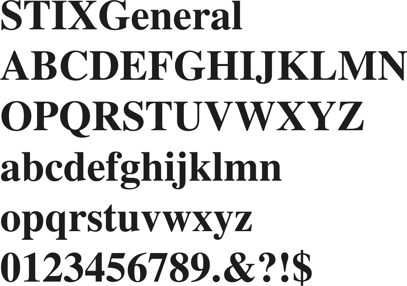
Stix Generale
Secondary font - StixGeneral
Replacement Fonts
In situations where the brand font cannot be used (for example in emails), we use these replacement fonts
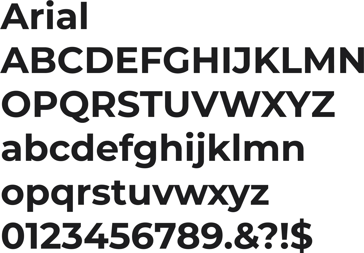
Replacement font - Arial
Arial is a replacement font for Montserrat
Typographic Hierarchy
Establishing a clear and consistent typographical hierarchy is essential to guide the reader's attention and improve the overall legibility of brand communication materials.
Headlines
When setting the font in headings, the line spacing should be consistent across different applications. Line spacing indicates the space between lines of text. Line spacing can be calculated using the following formulas. Font sizes are just examples.

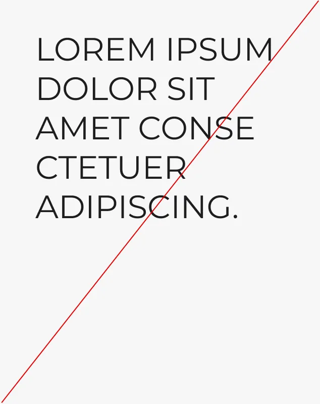
Headline Style 1
Weight: Montserrat Bold
Case: UPPERCASE
Leading: 100% - 120%
Tracking: -10pt — 10pt

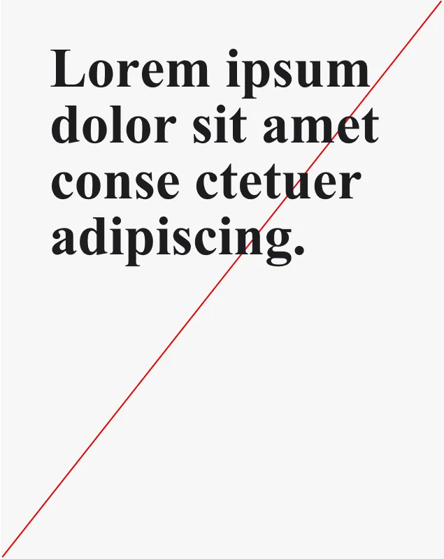
Headline Style 2
Wight: Montserrat Bold
Case: Normal
Leading: 100% - 120%
Tracking: -10pt — 10pt

Subtitle Style 3 - For English Texts
Weight: Montserrat Bold
Case: Subtitle Size
Leading: 100% - 120%
Tracking: -10pt — 10pt
Longer texts
Careful typesetting improves the appearance of paragraphs -- but more importantly, makes them easier to read. Use Bold for subheadings, and Regular for longer texts.
Paragraph text
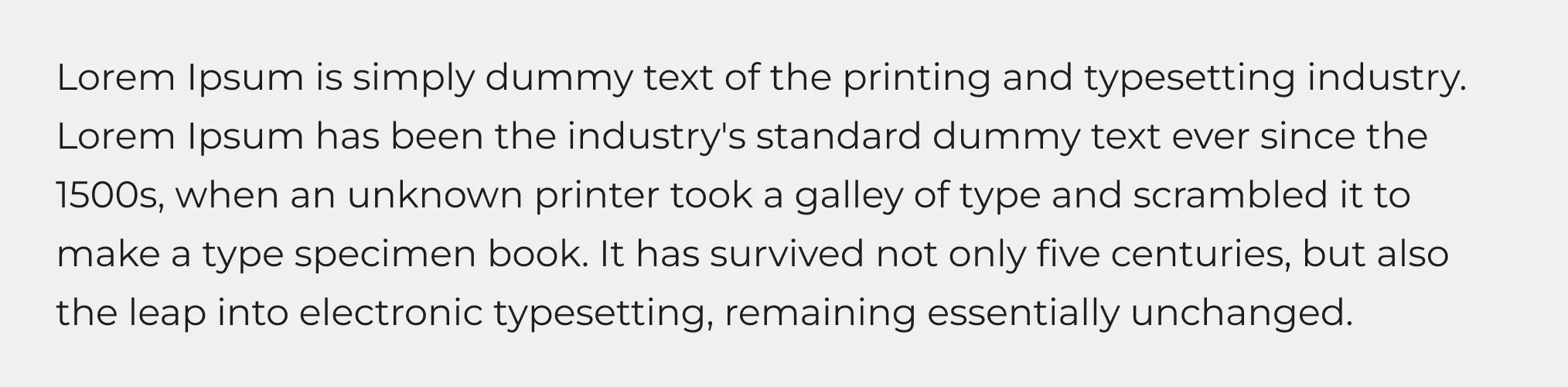
Paragraph text
Wight: Montserrat Regular
Case: Normal
Leading: 120% - 160%
Tracking: -10pt — 10pt
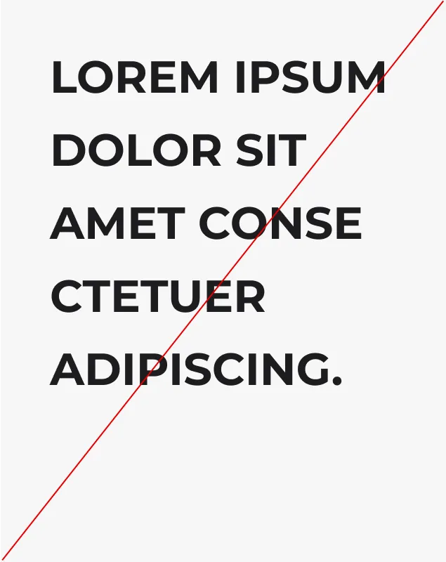
Prohibited use
Below are prohibited ways to use fonts and typesetting.

Improper poking
Improper poking

Right alignment
Incorrect cut headline rate
Use of unapproved fonts

Mixing different subtitle styles