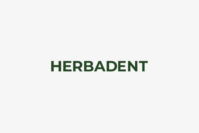
Basic variants of the logo
We use a logo with the Herbadent brand name as a logo. We use this logo in two variants.
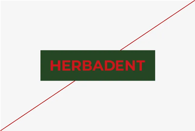
Basic variant without underlay
Primarily, a dark green logo with no backing is used.

Supplementary variant with backing
An additional option is a dark green logo on a light green background.

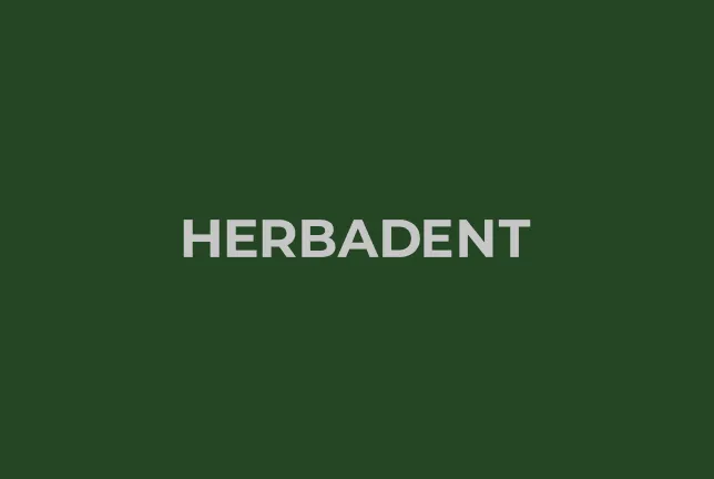
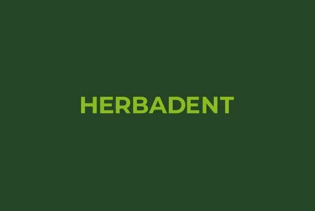
Negative variants of the logo
Negative logo is used for placement on dark backgrounds. When placed in the background, we strive for maximum readability.
Where possible, we apply the logo in negative gray or light green design on a basic dark green background.

Grey finish (Primary) on green background

Light green finish (Secondary)

White finish (Tertiary)
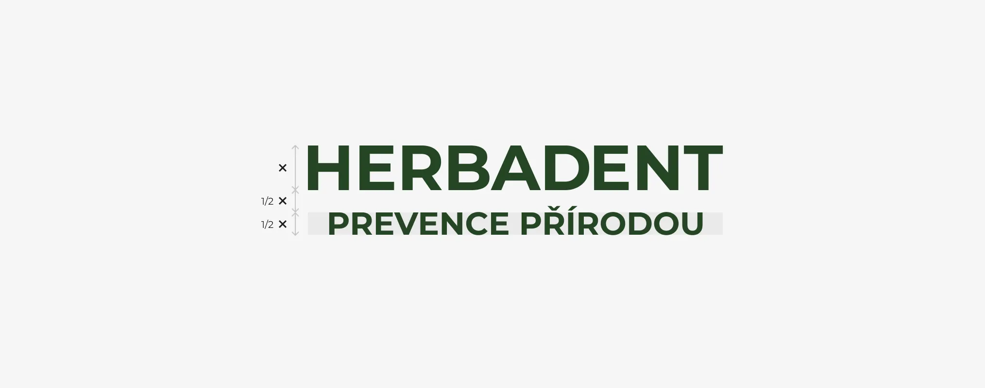
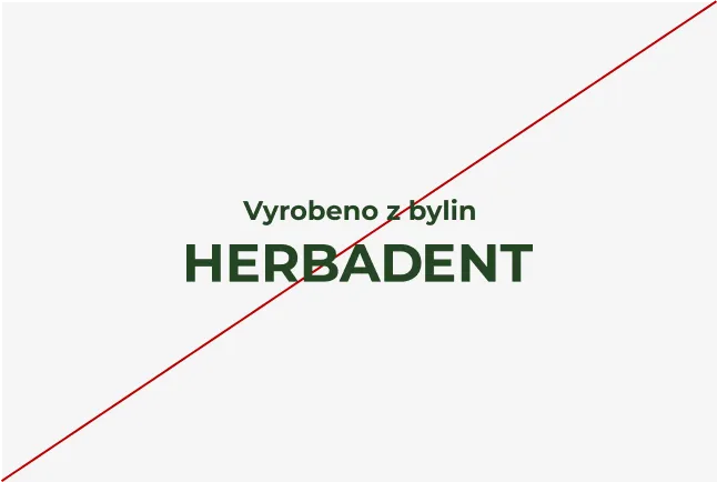
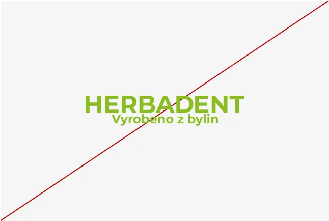
Logo with a claim
The placement of the slogan in the logo follows the rules set out in the diagram below. The default value is determined by the height of the letter H.
Monochrome use with slogan
Placement of the slogan in the logo in a monochrome variant.

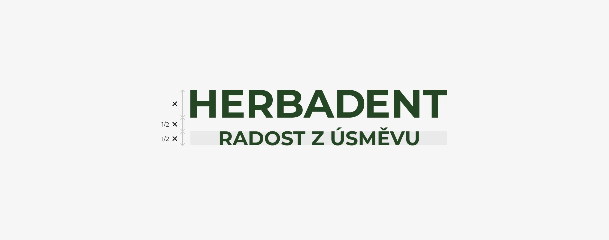
Two-color use with slogan
Placement of the slogan in the logo in a two-color variant.

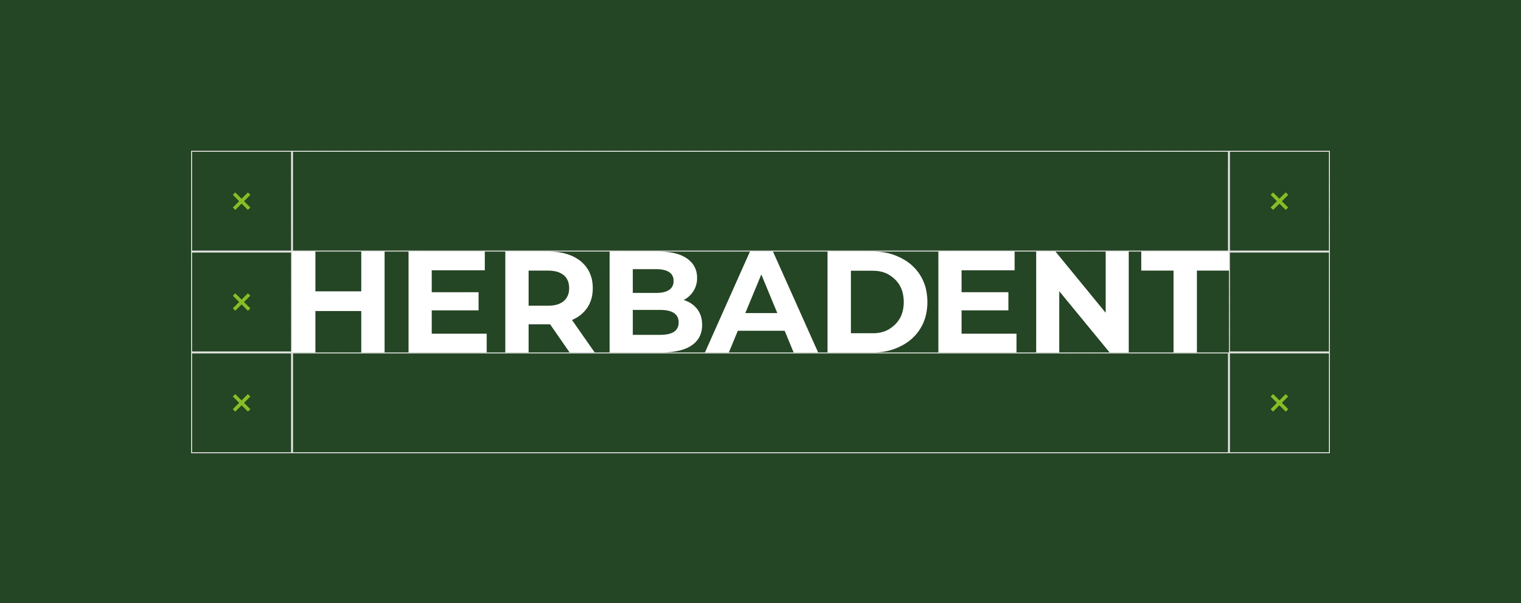
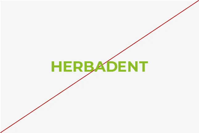
Protection zone
To preserve the visual integrity of the brand, a protective zone for logos is established. This zone establishes a space in which no graphics outside the slogan must be placed.
Basic variant without underlay
The protection zone is defined according to the height of the letter H in the logo.

Supplementary variant with backing
The protection zone is defined according to the height of the letter H in the logo.
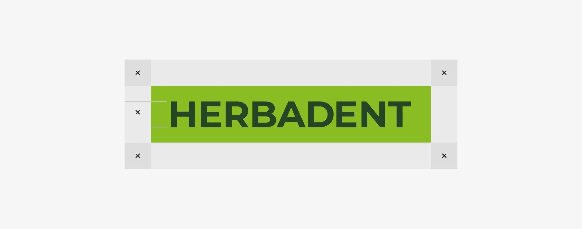
Minimum size
To maintain good legibility and recognizability of the logo, it is necessary to respect its minimum size. The minimum size is defined for prints in mm and for displays in px. It is forbidden to use the logo in a size smaller than the minimum.
Basic variant without underlay
The minimum size is set at 23 mm of total width.

Supplementary variant with backing
The minimum size is set at 29 mm of total width.

Using a logo for brands
In the event of a partnership or any combination with other logos, please give preference to the background version. The protective zone between the logos is the height of the obelisk.
Logo on the background
When applied in the background, the logo must always be clearly legible. This is important to ensure visual quality. Sufficient contrast should be maintained between the logo and the background. If easy recognition of the mark from the underlying surface cannot be ensured, the mark is not applied to the surface.
Allowed variants
Below are suitable variants for working with a logo on the background. We prefer to use the basic variant without underlay.
Logo in dark green color on white background
Logo in gray on base background
Logo in light green color on base background

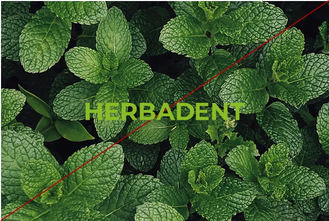
Logo in the photo

Logo in the photo
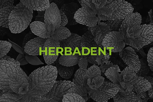
Logo in the photo
Prohibited variants
Below are the inappropriate variants for working with the background logo.
Logo in light green color on white background

Additional variant with a background on a colored background.

Logo in white on light green background

Photos with a lot of detail
Insufficient contrast
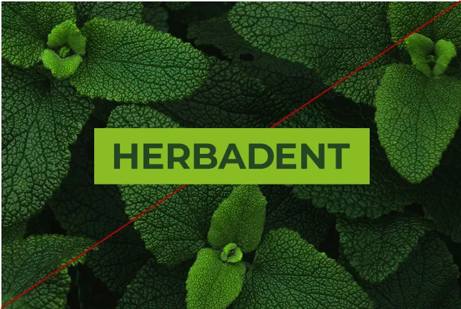
Additional option with a background in the photo.

Black logo on the background
Prohibited variants
Below are defined prohibited ways to work with the logo.

Labels
Labels
Labels
Labels

Labels
Labels