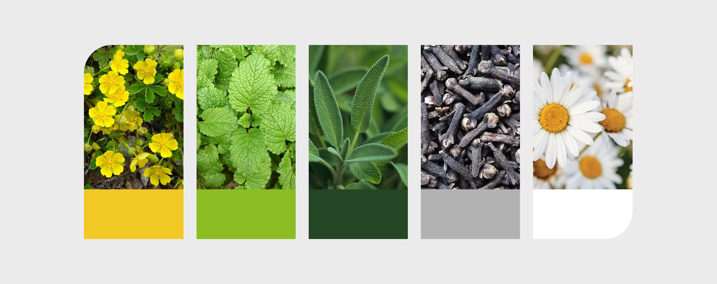
Brand Colors
To maintain a consistent appearance and recognizability of the brand, it is important to adhere to the prescribed color scheme. The visual identity of Herbadent uses two primary shades of green and to these complementary white, gray and black.
Primary color
Pantone: 560 C
CMYK: 83 46 93 53
RGB: 37 69 36
HEX: 254524
Copia hex
Secondary color
Pantone: 375 C
CMYK: 54 0 100 0
RGB: 138 189 36
HEX: 8ABD24
Copia hex
White
White
CMYK: 0 0 0 0
RGB: 255 255 255
HEX: FFFFFF
Copia hex
Grey
Pantone: Cool Grey 5C
CMYK: 28/21/18/1
RGB: 178/178/178
HEX: b2b2b2
Copia hex
Black
Pantone: Process Black C
CMYK: 0/0/0/100
RGB: 0/0/0
HEX: 000000
Copia hex
Complementary Color
Accent color serves in graphic materials to highlight and attract attention. Use this color sparingly and always in combination with the main colors of the brand - primary or secondary color.
Pantone: Pantone: 7406 C
CMYK: 0, 13, 100, 1
RGB: 241 200 37
HEX: #F1C825
Copia hex
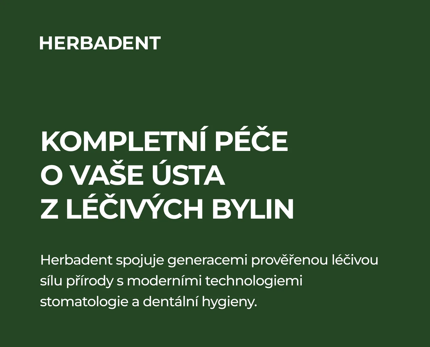
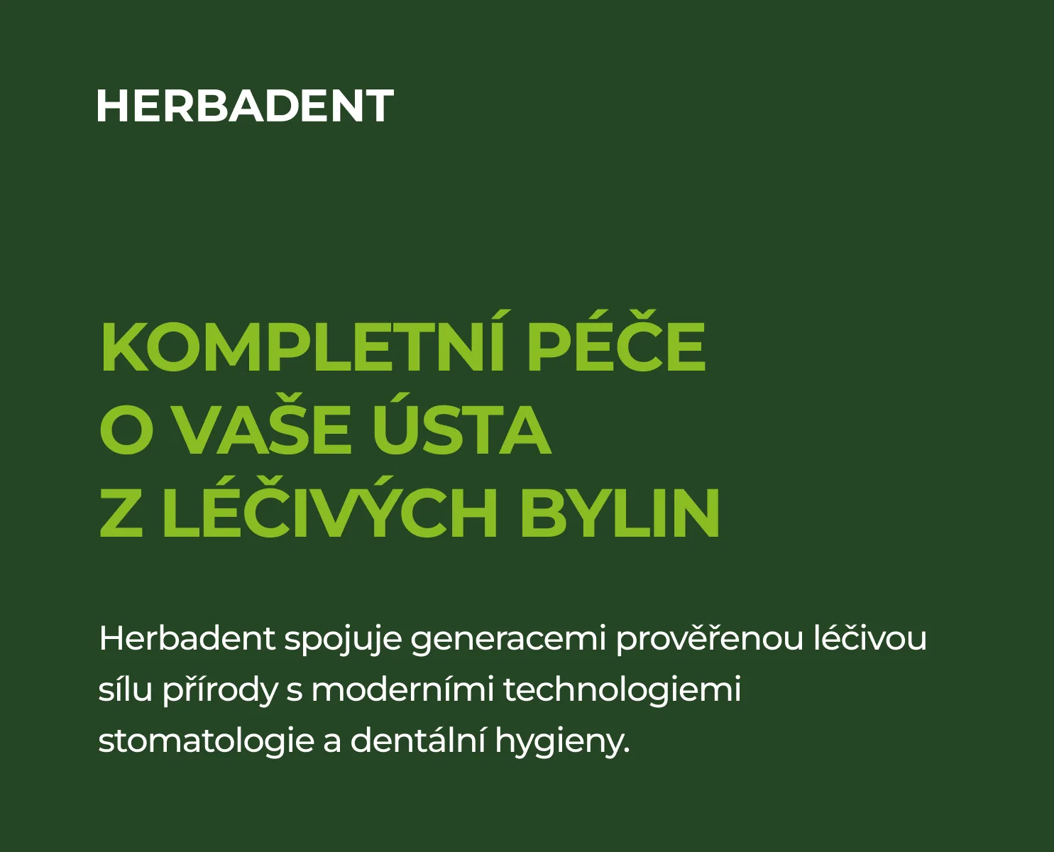
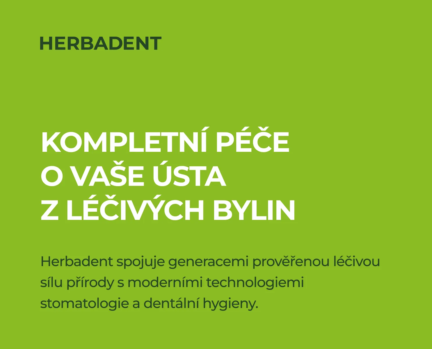
Work with colors
To maintain the integrity of the visual identity, it is necessary to adhere to the proposed color scheme. As a rule, we use one primary color, which we can supplement with one accent color.
Combination 1
In this use, we use the primary color in combination with white.
Combination 2
In this usage, we use primary color in combination with secondary color and white.
Combination 3
In this application, we use one color from the primary palette and use either an accent color or a secondary color for highlighting.